Open any print-on-demand shop on Etsy and you'll see two kinds of product photo. Lifestyle shots put the product in a scene: a tote on someone's shoulder, a print above a sofa. Flat lays show it from above on a surface, styled with a few props. Both work, but they do different jobs, and knowing which job you need is what makes a listing convert.
Lifestyle mockups sell the feeling ("this is how it looks in my life") and work best as the first or second photo for decor and fashion buyers. Flat lays sell the product ("this is exactly what you get"), make the design easiest to read, and are strong thumbnails for bold graphic designs. The best listings use both: a lifestyle shot to attract, a flat lay to reassure, then details. Test which one leads in your niche.
What's the difference between lifestyle and flat lay mockups?
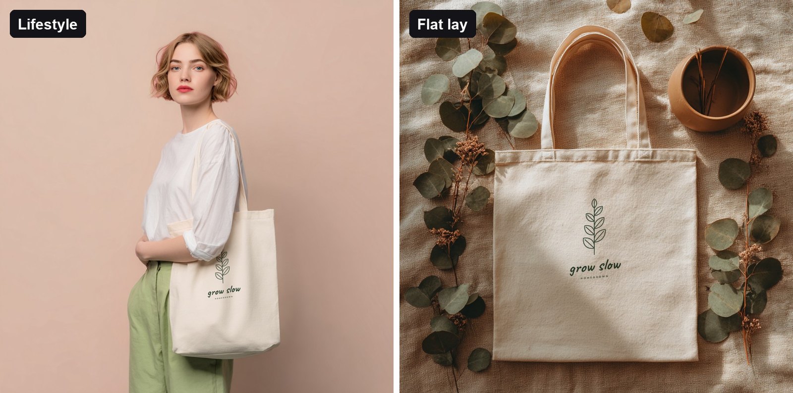
| Lifestyle | Flat lay | |
|---|---|---|
| What it shows | The product in use, in a room or on a person | The product from above on a styled surface |
| Sells | Emotion, scale, the "look" | Clarity, detail, exactly what arrives |
| Design visibility | Smaller, sometimes at an angle | Large and straight-on |
| Best for | Decor buyers, apparel, gifts | Graphic designs, typography, sets and bundles |
| Risk | Props or the model can distract from the design | Can feel flat or generic if every shop uses the same one |
When does a lifestyle mockup sell better?
- When buyers shop for a look. Boho bedroom, Scandinavian living room, cosy autumn kitchen. The scene is half of what they're buying.
- When scale matters. A print above a sofa or a tote on a shoulder answers "how big is it?" instantly.
- For apparel. Buyers want to see fit and how a design sits on the body. See our T-shirt mockup guide.
- For gifts. A lifestyle shot helps the buyer picture the recipient using it.
When does a flat lay sell better?
- When the design is the hook. Bold typography, funny slogans and detailed illustrations read best large and straight-on.
- As a thumbnail in a crowded niche. A clean flat lay is easy to read at small sizes; see how to win the thumbnail click.
- For sets and bundles. Several prints or products laid out together show the whole bundle at once; our print set guide uses flat lays for exactly this.
- To reassure. A flat lay shows the whole product with nothing hidden: the full print, the full bag.
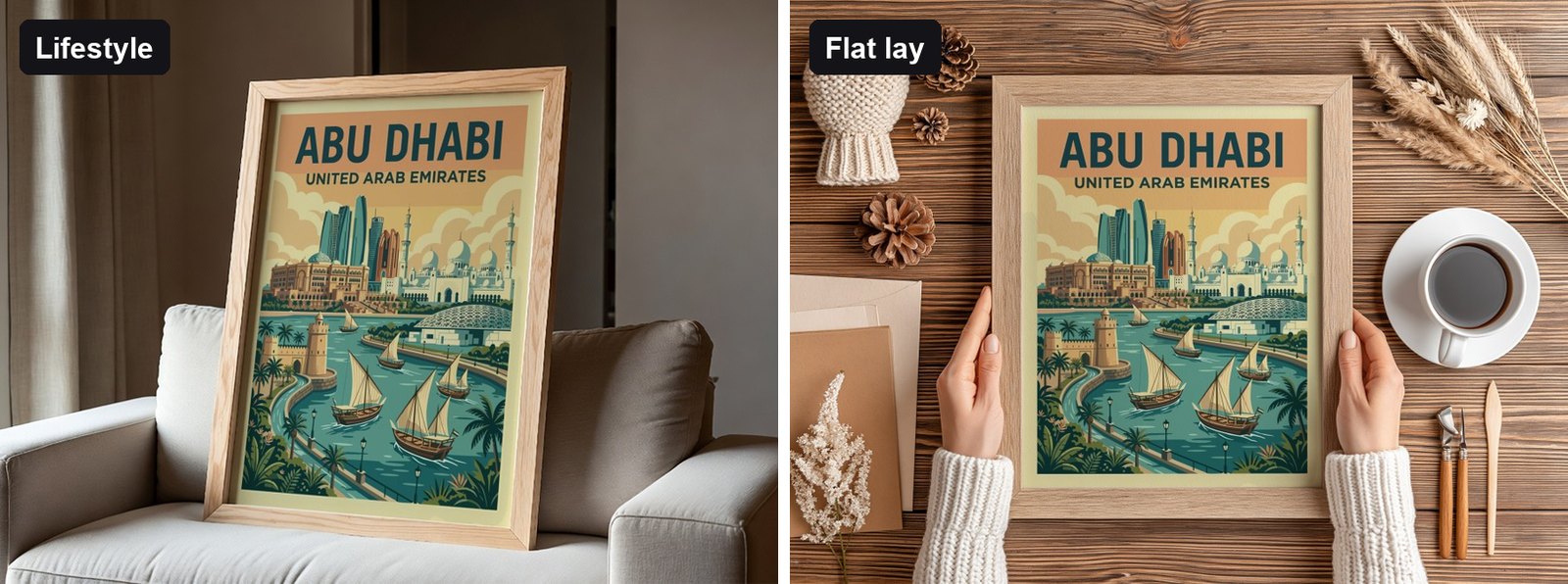
For wall art, a top-down shot of a frame held in hands (like the hands holding an oak frame template) combines both: the clarity of a flat lay with a human touch.
What makes a good flat lay?
- A surface with texture but no pattern: linen, wood grain, a soft rug. It adds warmth without fighting the design.
- Two or three props, not ten: a coffee cup, a sprig of eucalyptus, a candle. Props should point to a lifestyle (cosy, creative, natural) without covering the product.
- Soft, even light: gentle shadows make it feel real; harsh shadows across the design make it hard to read.
- Space around the product: leave room at the edges so Etsy's thumbnail crop doesn't cut it off.
- Colours that suit the design: warm neutrals for earthy palettes, cooler greys for black and white or blue art.
Which should be your first photo?
There's no universal winner, which is why it's worth testing. As a starting point:
| Product and niche | Try first |
|---|---|
| Decor-led wall art (boho, Scandinavian, botanical) | Lifestyle room shot |
| Graphic and typography prints | Clean flat lay or minimal hero |
| T-shirts and sweatshirts | Model shot with a large, visible print |
| Tote bags | Flat lay or hanging bag on a plain background |
| Print sets | Flat lay or gallery wall with every print visible |
Run each version as the first photo for two weeks and compare visits and conversion in Etsy Stats. Keep the winner, and use the other as photo 2.
How many of each should a listing have?
A balanced listing for most products looks like this:
- Your winning first photo (lifestyle or flat lay).
- The other style, so both kinds of buyer are covered.
- A second lifestyle scene in a different setting.
- A close-up detail.
- Sizes, options and what's included.
That's the core of the 10-photo checklist. For tote bags specifically, our tote bag mockup ideas go deeper.
Make sure your design sits naturally in both styles. A design printed edge to edge on a mug or tote looks cramped in a close flat lay. Give it some space around it, like the tote above, and it reads well in both.
How do you make both styles for every design?
Pick one lifestyle and one flat lay template per product from the template library, load all your designs into Scaylr and generate. Every design gets both photos in one batch, so testing which should lead costs you nothing but a few minutes.
Warm lifestyle lighting can shift how colours look. If colour accuracy matters (for example on apparel), include one neutral, evenly lit flat lay so buyers know what they're getting.
Make lifestyle and flat lay photos in one go
Choose both templates, drop in your designs, and test which one sells better, without a single photoshoot.
Try Scaylr Free →