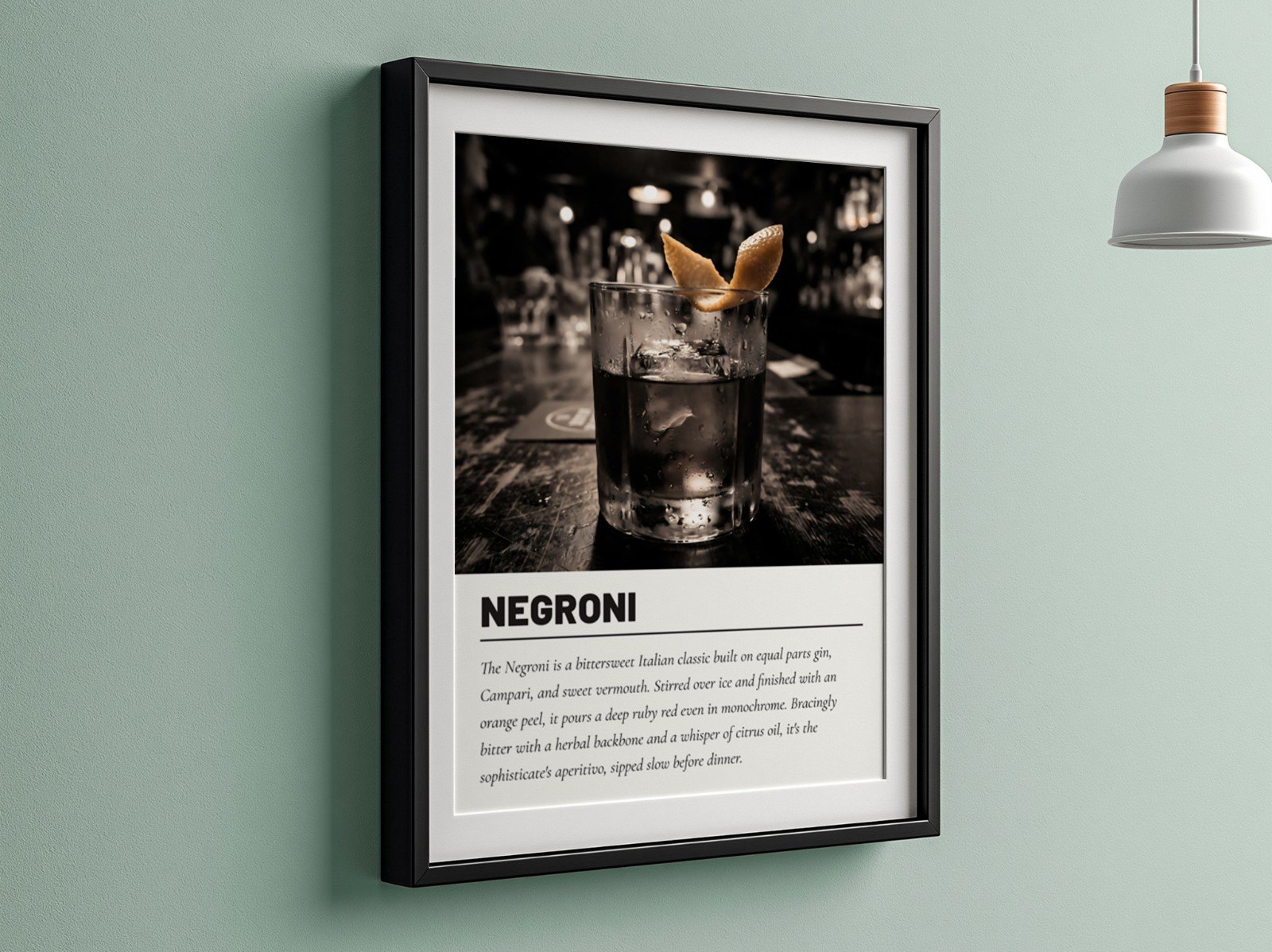
On Etsy, your first photo does two jobs at once. It's the opening shot of your listing, and it's your advert in search results, where it sits in a grid next to dozens of similar products. If it doesn't earn the click, nothing else in the listing matters.
Your first Etsy photo becomes your search thumbnail, shown small and cropped. To win the click: make the product fill most of the frame, use a calm background, keep colours bright and true, avoid text overlays and heavy props, and check how it looks at thumbnail size before you publish. Test a clean hero shot against a styled room scene and keep whichever gets more clicks.
What does Etsy do with your first photo?
Etsy uses the first photo in your listing as the thumbnail everywhere a buyer might find you: search results, category pages, your shop page and "you may also like" suggestions. In search it is shown small, and Etsy lets you adjust how the thumbnail is cropped when you edit the listing. Our Etsy image size guide covers the exact dimensions; a 3000 × 2250 px (4:3) image crops cleanly.
That means your first photo isn't judged at full size. It's judged in a fraction of a second, at the size of a playing card, surrounded by competitors.
What makes a thumbnail get clicked?
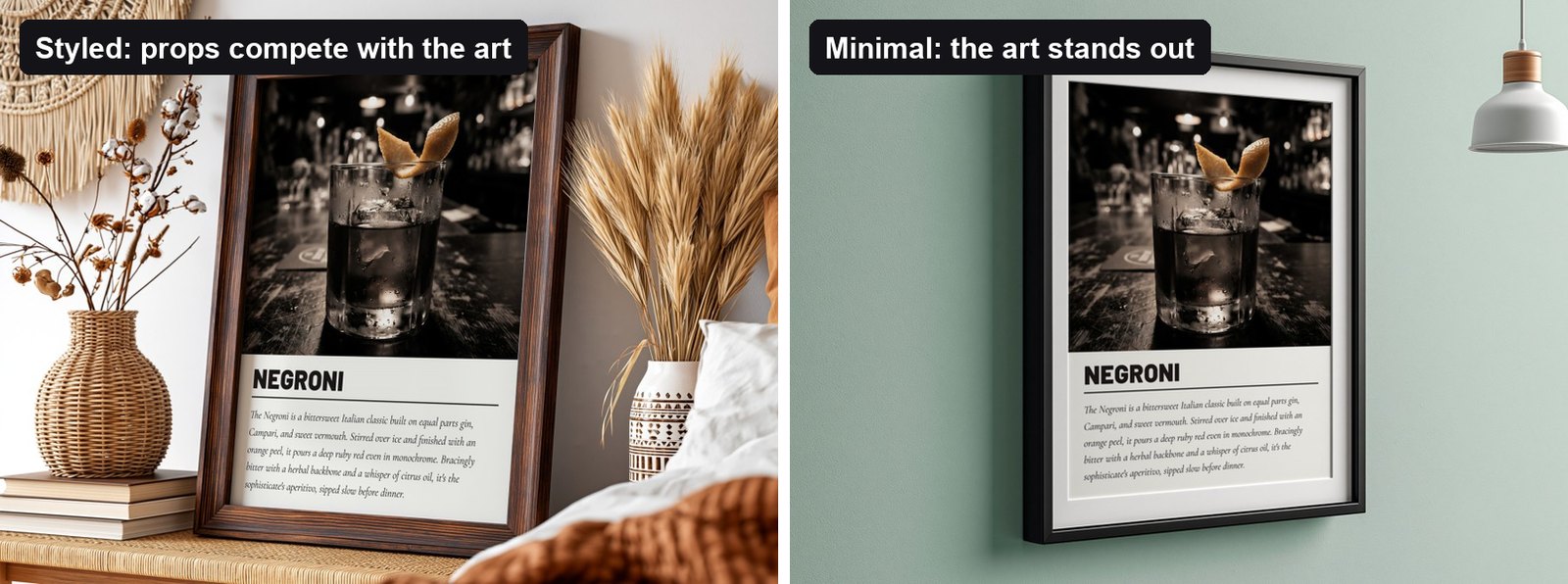
Both mockups above are good photos. But look at them the way a buyer does, small and quickly:
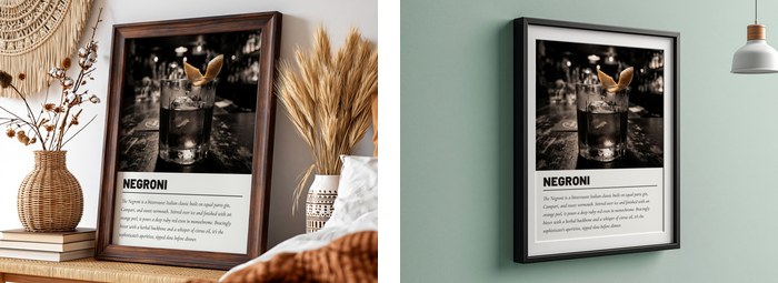
At thumbnail size the styled scene turns into texture and props, while the minimal one still reads as "a Negroni cocktail print" instantly. That's the whole game.
| Do | Avoid |
|---|---|
| Product fills 50–70% of the image | Small product in a big room |
| Calm, plain or softly blurred background | Busy patterns and lots of props |
| Bright, even light and true colours | Dark, moody scenes for light-coloured art |
| Straight-on or gentle angle | Extreme angles that distort the design |
| The actual design, clearly visible | Text overlays, collages, borders and badges |
Etsy's own photo guidance favours clean product images. Big "SALE" banners or collages of six products make the thumbnail harder to read and look like ads. Put details like sizes and "digital download" in photos 8–10 instead.
How do you check your thumbnail before publishing?
- Shrink it. View the image at about 300 px wide, or step back from your screen. Can you still tell what the product is?
- Squint test. Squint at it. The design should still be the brightest, clearest shape in the picture.
- Compare in context. Search your main keyword on Etsy and picture your thumbnail in that grid. Does it stand out, or blend into the beige?
- Check the crop. After uploading, open "Adjust thumbnail" in the listing editor and make sure nothing important is cut off.
If every top result for "botanical print" is a white frame on a white wall, a sage green or dark wall will pop. Look at the grid first, then pick the scene that contrasts with it.
Clean hero or styled scene: which wins?
It depends on your niche, which is why it's worth testing. Minimal hero shots tend to win for bold graphic art and typography, where the design itself is the hook. Styled scenes can win for decor-led buyers who shop for a "look", such as boho bedrooms or cosy living rooms.
A simple way to test: publish with the clean hero first for two weeks, note the views and visits in Etsy Stats, then swap in the styled scene for the next two weeks. Keep the one with the better click rate. Because mockups let you produce both versions in seconds, testing costs you almost nothing.
Keep one "hero template" for your whole shop, for example a black frame on a sage green wall. Using the same hero scene for every listing makes your shop page look like a curated collection.
Does the same apply to mugs, T-shirts and tote bags?
Yes, with a few product-specific twists:
- Mugs: show the side with the design facing the camera and the handle to one side, not in front of the artwork. A close crop of hands holding the mug often beats a wide kitchen scene. More in our mug mockup guide.
- T-shirts: a flat lay or a close model shot where the chest print is large reads better in search than a full-body street photo. Save the lifestyle shots for photos 2–4. See the T-shirt mockup guide.
- Tote bags: the bag should fill the frame. Hanging or flat-lay shots on a plain background make the print easy to read at a glance.
- Digital downloads: the thumbnail should still show the design in use, framed in a room, rather than a flat file preview. Buyers are picturing their wall, not a PDF.
Whatever the product, the rule is the same: the design must be recognisable at thumbnail size, and nothing in the scene should compete with it.
How do you make hero shots for every design at once?
Pick your hero template and a couple of alternatives from the template library, load all your designs into Scaylr and generate. Every design gets the same clean first photo, plus alternatives for testing. Then build out the rest of the listing with the 10-photo checklist.
Make a hero shot for every design
Choose a template, drop in all your designs, and get a consistent first photo for every listing in one batch.
Try Scaylr Free →