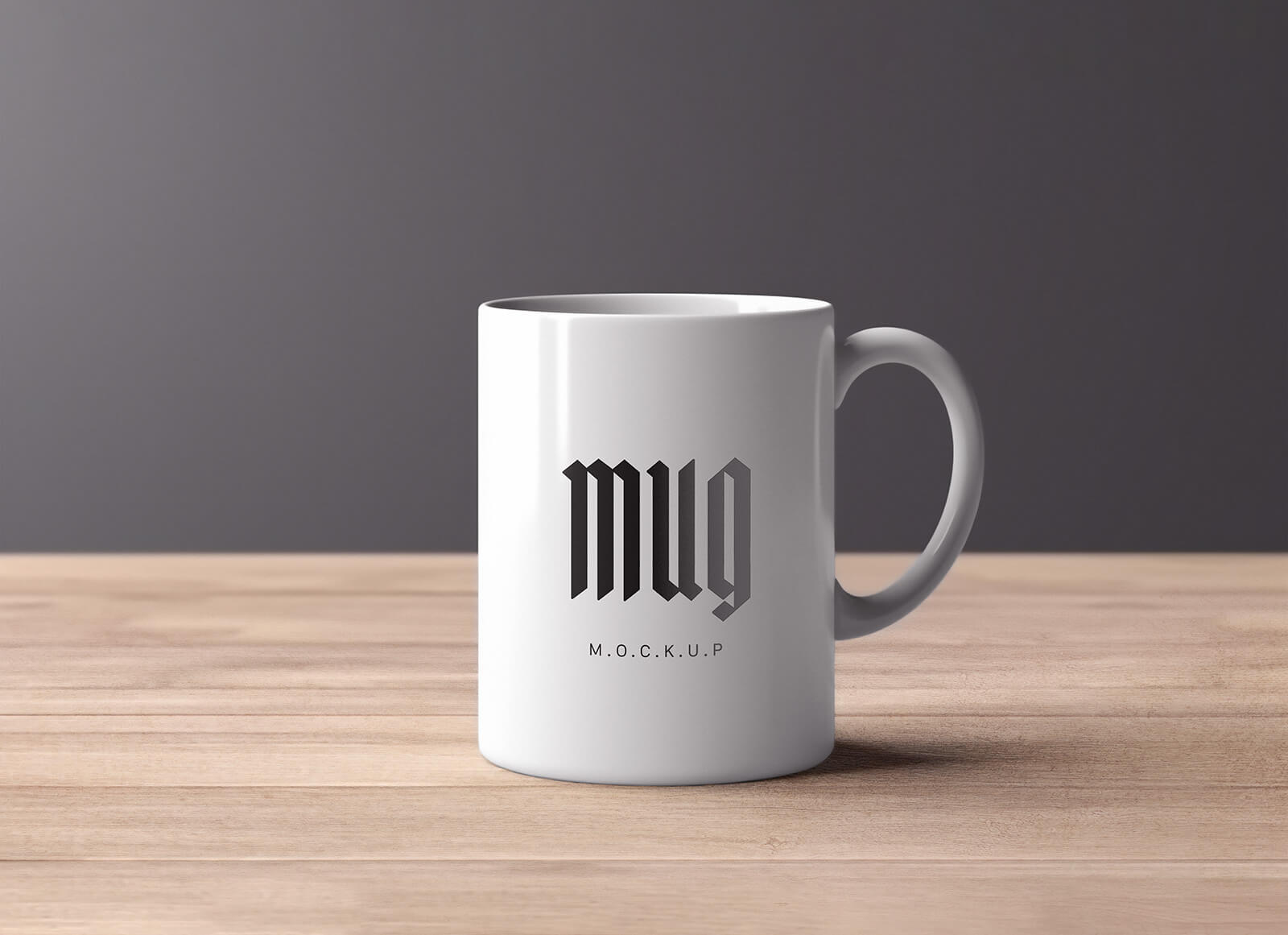
Most mug listing problems trace back to one thing — wrap direction. A design can appear backwards depending on which way the handle faces, and most sellers don't catch it until a buyer does. Beyond that: match your mug type to your design style, show both handle orientations in your photos, and put the mug in a setting your buyer recognises from their own morning.
Mugs are one of the most searched product types on Etsy, which also makes them one of the most competitive. A well-designed mug in a bad mockup loses to a mediocre design photographed well. The thumbnail decides whether anyone clicks, and that decision happens before a buyer reads a single word of your listing.
What follows covers the practical decisions: mug types, wrap vs patch designs, handle direction, settings that convert, and what a complete listing photo set looks like.
Mug types and what they mean for your mockup
The 11oz ceramic mug is the default on most POD platforms and the one buyers picture when they search "mug." Use it as your primary mockup. The proportions are familiar, the shape is neutral, and it reads as a daily-use item rather than a specialty product.
The 15oz mug photographs taller. Designs with significant vertical space look better on it. Designs that are wide or panoramic can look compressed. If your design was built for an 11oz, check before using a 15oz mockup — it isn't always an improvement.
Enamel mugs (the speckled camping-style ones) carry a completely different aesthetic. They read outdoorsy, rugged, and gift-appropriate. The mug's personality competes with the design in a way a plain ceramic doesn't. Only use enamel mockups if your design belongs in that world — nature themes, hiking references, cottagecore, that kind of thing.
Travel mugs and tumblers need their own mockups. The cylindrical surface, the lid, the proportions — all of it changes what works visually. A flat mug template applied to a travel cup design will look wrong.
Include a size comparison image showing the 11oz and 15oz side by side with dimensions labelled. Buyers frequently ask which size is bigger. One image in the listing answers it before they have to reach out.
Wrap vs patch designs — where most listing problems start
A wrap design goes all the way around the mug, or most of the way. The design continues behind the handle. On the mockup, you're only seeing the front portion. If the most important part of your design sits on the right side, it might be partially hidden depending on which way the handle faces.
A patch design sits in a defined area on the front of the mug — the rest is plain. These are simpler to mockup because the design is always fully visible from the front regardless of handle direction.
If you're selling a wrap design, this is the thing to get right before anything else. Open your mockup template, look at where the design falls relative to the handle, and check both handle orientations before finalising your listing photos.
Run your wrap design through a handle-left and a handle-right version before picking your main photo. They often look significantly different. The version that shows more of the design isn't always the better listing image — sometimes the other angle has better composition or more natural light.
Handle direction — the detail most sellers overlook
For a right-handed buyer (the large majority), the handle faces right. They pick up the mug with their right hand and the design faces them. A handle-right mockup shows the design from the buyer's natural point of view.
Handle-left mockups often show more of a wrap design's front face, so they tend to look better in the photo. Many sellers lead with them for exactly that reason. The problem comes when the buyer receives the mug, holds it naturally, and the focal point of the design is facing away from them.
Use both orientations in your listing. Lead with whichever shows the design most clearly, but include the other so buyers can see the full picture — and so you're covered when someone asks "which side has the design on it?"
Settings that work
Kitchen counter is the obvious choice, and obvious because it earns clicks. A mug on a counter with soft morning light communicates "daily use item." It's the highest-converting setting for mugs with broad appeal. Natural light from the side works better than overhead — it brings out the mug's shape and keeps the design readable.
Desk or workspace suits quotes, motivational text, and anything with a work or study angle. A notebook, pens, or a laptop softly blurred in the background places the mug without overpowering it. Keep the styling minimal — the mug should still read clearly at thumbnail size.
Outdoor or camping only works if the mug type and design fit. An enamel mug in a woodland or mountain setting looks considered. A standard ceramic mug in the same scene looks like someone forgot to bring the right prop.
Flat lay on a wooden or stone surface is a useful alternative angle, particularly for gift-oriented designs. Style it with objects that relate to the design theme — a book for a reading mug, pressed flowers for a botanical one. Generic props make the scene feel assembled rather than intentional.
What to avoid
Plain white or grey backgrounds. These work for product specs, not for selling an object someone will use every day. Buyers are deciding whether they want this mug in their kitchen, not comparing technical specifications. Give them context.
Mugs too small in the frame. Mug designs often include text. Small text at thumbnail size — the size at which buyers first see your listing in search results — is illegible. Fill more of the frame with the mug than feels comfortable. Check how the main photo looks at 200px wide before publishing.
Showing multiple mugs in one image to display colour variants. One well-composed mug outperforms a grid of three. Colour variants work better as separate photos, each given its own full-frame treatment.
Mockup angles that hide the design. Three-quarter view from above can look stylish but often shows the top rim more than the design. The most common mug mockup mistake is choosing an angle that looks professional in the template but makes the actual design hard to read.
A complete mug listing photo set
A solid lineup for a standard ceramic mug listing:
- Main lifestyle shot — kitchen or desk, handle right, clean styling
- Handle-left version or a second setting (bedroom shelf, outdoor table)
- Close-up of the design area showing print clarity
- Flat lay with relevant props
- Size reference showing 11oz vs 15oz if you offer both
- Enamel or travel mug variant (if applicable)
Six photos is a reasonable minimum. Nine is better, particularly if you have multiple sizes or colour variants to show. Think of each image as handling a specific buyer objection — print quality, size, how it looks in a real space, what the variant colours look like.
Generating this set manually for every mug design takes time. Using batch generation through the Scaylr mug template library, you can run a design through multiple mug styles and settings in a single session. The full Etsy mockup guide covers the end-to-end workflow if you want the broader process.
Most mug listing photos fail at the small screen, not the large one. Your main photo will be seen at thumbnail size hundreds of times before a buyer clicks it. Test it small before you publish it large.
Generate mug mockups without Photoshop
Browse ceramic, enamel, and travel mug templates in the free Scaylr library. Upload your design and batch-export the full set as a ZIP.
Try Scaylr Free →