Tote bag listings underperform on Etsy mostly because of weak mockups. A tote bag is a lifestyle product — buyers want to see it in use, not hanging flat against a white background. The best-performing mockups show the bag in a realistic scene: a market, a coffee shop, a beach. The design still needs to be clearly visible, but the context sells the bag as much as the design does.
Tote bags are one of the most underrated products in print-on-demand. They have a large, active buyer base on Etsy, they carry decent margins, and the designs that work on them range from simple text to detailed illustration. The problem is that most listings show the bag in the worst possible way: a flat, poorly lit image with no context, where the bag looks like a generic product rather than something worth buying.
The mockup does most of the work in a tote bag listing. Here is how to do it properly.
Why tote bags are harder to mockup than flat products
A framed art print lies flat. Its edges are defined. The design occupies a clean rectangle that mockup templates handle naturally. A tote bag is none of those things. It has two usable faces, a base that may or may not be visible, handles that extend above the body, and fabric that drapes, wrinkles, and folds depending on what is in the bag or how it is held.
A flat, empty tote bag laid on a surface looks exactly like what it is: a flat, empty bag. It communicates nothing about how the product looks in real life, and it does nothing to help buyers imagine owning it. The challenge is that many free PSD mockup templates for totes are exactly this format, which is why so many Etsy listings look identical and forgettable.
The format that works is the bag in use or near-use: filled slightly so it holds its shape, held by a handle, resting in a setting that communicates lifestyle. That extra context is what makes a buyer stop scrolling.
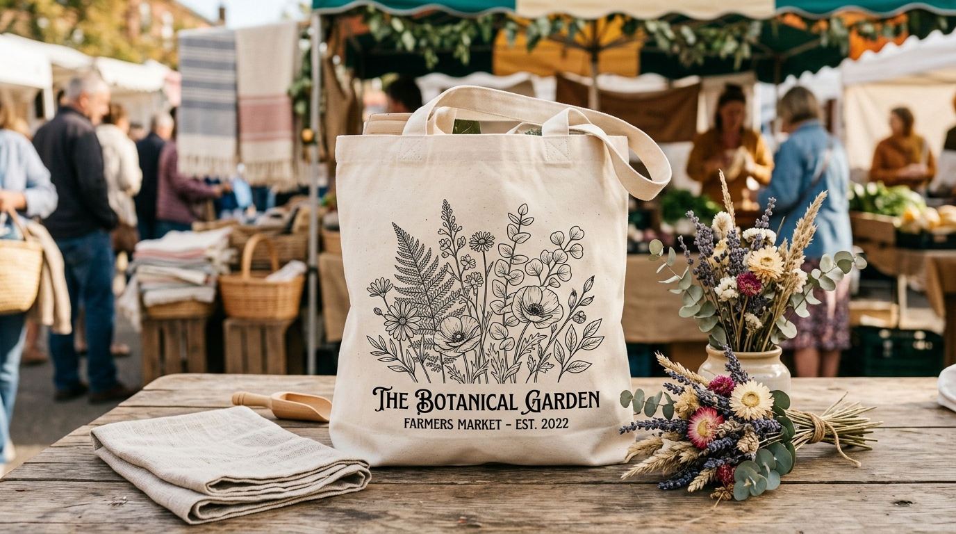
Context shots that convert
The most effective tote bag mockup settings share one characteristic: they show the buyer a life they want to have, with the bag as a natural part of it. The specific scene depends heavily on your niche.
For a bag with a botanical or nature design, a farmers market or outdoor context works naturally. The bag looks at home beside fresh produce, flowers, or a wooden market table. Warm light, earthy tones.
For a minimalist or aesthetic design targeting the lifestyle-decor buyer, a clean interior scene works well. The bag hanging on a hook in a minimal hallway, resting against a white-painted bench, or sitting beside a stack of books on a light-wood floor communicates the same considered aesthetic that the buyer applies to everything else they own.
For a fun or quirky design — niche identity shirts, pet designs, slogan bags — a coffee shop context or casual outdoor setting (bench, step, grass) adds energy without being too styled. These buyers are not decorating a minimalist flat; they want a bag that makes people smile.
Beach settings sell consistently for summer launches and coastal/nature designs. The bag in the sand, filled and resting upright, or over someone's shoulder walking toward water. Seasonal and aspirational in one image.
Whatever scene you choose, the design on the bag must remain clearly readable. A beautiful lifestyle scene where the bag is angled away from the camera, half in shadow, or competing with busy background elements is a failed mockup. Buyers need to be able to see what they are buying within the first glance.
Design visibility on a tote bag
Tote bags are three-dimensional and flexible. A design printed on a flat surface reads differently once the fabric has any drape or movement. There are two things worth getting right before you commit to a design and mockup combination.
Placement: most tote bag designs sit on the front face, centred, roughly in the middle third of the bag height. Placing the design too high or too low creates awkward proportions when the bag is filled. If your mockup template shows the design placed unusually, it is worth adjusting rather than accepting the default position.
Scale: designs that look strong at the scale of a phone screen or design canvas often look small and lost on a tote bag. A text design needs to be large enough to be legible at a distance of a metre or two, which is how bags actually get seen in the real world. Test your design at the full bag scale before finalising the mockup, not just at the preview thumbnail scale.
Building a full listing image set for a tote bag
A complete tote bag listing typically needs five to seven images to give buyers enough confidence to purchase. Here is a structure that works:
The lead image is a lifestyle or context shot with the bag in a relevant setting, design clearly visible, ideally filled enough to show its real shape. This is the image that earns the click from search results.
The second image shows the design more directly: either a closer crop of the front face, or a flat lay on a clean surface where the design is fully legible and unobstructed. Buyers who clicked want to confirm exactly what the print looks like.
The third image covers a different angle or context: the bag held by the handles (showing the proportions and handle length), a rear or side view, or a second lifestyle scene in a different setting to broaden the appeal.
The fourth image handles practical information. A graphic showing the bag dimensions, available colours if multiple are offered, or a scale reference showing the bag relative to a person or common object. Tote bag buyers frequently want to know actual size before purchasing.
Images five through seven, if you use them, can show interior detail (some buyers want to see the lining or inner pocket if the bag has one), a close-up of the handle attachment, or seasonal or contextual variants.
Colour and background choices
Natural tote colours — natural cotton, cream, or white — are the most versatile background for most designs. The light fabric shows colour prints accurately and does not compete with the design. Dark bag options are worth listing as separate colour variants if your design also works on dark backgrounds, but the natural version almost always makes the better lead image.
Background colours in lifestyle mockups should complement rather than match the bag. A natural cotton tote against a warm cream wall blends into the background; the same bag against a sage green or terracotta surface gets a visual separation that makes it read clearly in the image.
Avoid white-on-white combinations for any mockup where the tote is a natural or off-white colour. The bag edges disappear and the image looks flat. A subtle shadow or a textured surface adds the contrast needed to make the bag readable.
If you sell tote bags in multiple colours, generate a styled flat lay showing two or three colour variants side by side. This image works well as the fourth or fifth in a listing set and answers the "which colour should I choose?" question that otherwise becomes a message to your shop. Buyers who have their question answered in the listing are more likely to purchase than buyers who need to wait for a reply.
Generating tote bag mockups efficiently
The practical challenge for sellers launching multiple designs is producing a full set of lifestyle-quality images for each one without spending an hour per listing. PSD templates with smart object layers let you swap in your design and produce a consistent result across all your products, but opening and exporting each one manually adds up fast.
Scaylr runs your designs through multiple tote bag templates simultaneously and downloads the results as a zip, which means the image set for a 10-design launch takes roughly the same time as one design done manually. The free template library includes tote bag templates in several scene styles — flat lay, lifestyle, and context shots — so you can build a full listing set without sourcing your own PSDs.
For the broader listing strategy once your mockups are ready, the Etsy product launch guide covers titles, tags, pricing, and the first two weeks after going live.
The average tote bag listing on Etsy has one or two flat images that tell a buyer nothing about how the bag looks in real life. The bar for standing out is not high. A lead image that shows the bag in a real context, with the design clearly visible, already puts you above most of the competition in any niche. Add a full listing image set and you have a listing that looks like it was made by someone who takes the product seriously.
Generate a full tote bag listing image set in minutes
Upload your design, pick your templates, and download lifestyle and flat lay mockups ready for Etsy. Free to start.
Try Scaylr Free →