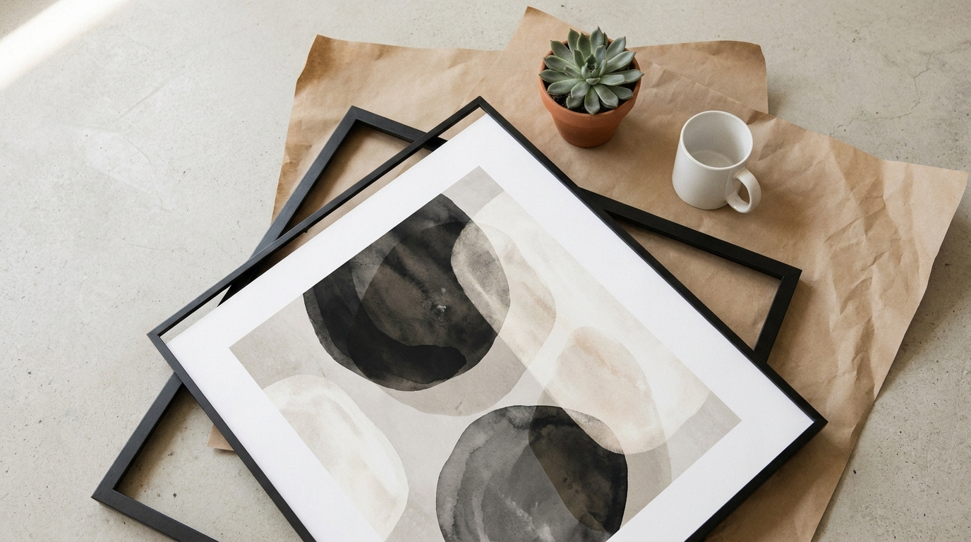
Poster mockups live or die on two things — the right sizes and the right context. Stick to the sizes buyers actually search for (8x10, 11x14, 18x24, A4, A3 for international markets), use lifestyle room settings over plain backgrounds, and vary the frame style and angle across your 9 photo slots. The frame choice matters more than most sellers realise.
A great poster design shown in a bad mockup won't sell. The reverse is also true — a mediocre design in a well-staged lifestyle photo can outperform far better artwork because the buyer is responding to the room, not just the print.
This guide covers the practical side: which sizes to offer, which mockup styles actually convert, and the mistakes that make listings look amateur even when the artwork is strong.
Poster Sizes That Actually Sell
The sizes you offer affect which searches you appear in and how many sizing complaints you deal with. Here's what works across markets.
US market (inches):
- 5×7 — small accent print, often sold in sets. Low price point, impulse buy.
- 8×10 — the most searched poster size on Etsy. Non-negotiable if you're selling in the US.
- 11×14 — step up from 8×10, popular for statement pieces in smaller rooms.
- 12×18 — less common but standard for photography prints.
- 16×20 — large wall art. Higher price, fewer sales, better margin per unit.
- 18×24 — movie poster proportions. Common for bold typography and graphic designs.
- 24×36 — large format. Niche but worth offering if the design suits it.
European and international (A-series):
- A5 (148×210mm) — desktop and small accent prints.
- A4 (210×297mm) — closest to 8×10. Very widely searched internationally.
- A3 (297×420mm) — popular for bedroom and living room art across the UK, Europe, and Australia.
- A2 (420×594mm) — large wall piece for buyers who want something to anchor a room.
If you're targeting UK, European, or Australian buyers, list your A-series sizes explicitly in your title and tags. A buyer in Germany searching for "A3 art print" won't find your listing if you only list inch dimensions — even if the sizes are equivalent.
Frame Styles and What They Communicate
The frame in your mockup sets the buyer's expectation before they read a word. It also signals who the product is for.
- Thin black metal frame — clean, modern, works across aesthetics. The safest default if you're picking one frame style to start with.
- Thin white frame — bright and airy. Works well for botanicals, watercolours, and minimalist designs. Popular in Scandinavian-style interiors.
- Natural light wood frame — warm and organic. Good for botanical, nature, and cottagecore niches. Feels less corporate than black or white.
- Wide gallery frame — traditional, premium feel. Works for fine art prints and photography. Looks heavy against modern minimalist designs.
- Floating frame — the design appears to float inside the frame with a visible gap around it. Higher-end aesthetic, growing in popularity.
- No frame (print only) — useful to include at least one unframed mockup. Some buyers source their own frames and want to see the artwork without styling.
Don't pick one frame style and use it for every listing. Run your design through a black, a white, and a wood frame — then use a different one as the main photo across related listings. Buyers browsing your shop see variety instead of everything looking identical.
Room Settings That Earn Clicks
The room context sells the lifestyle, not just the print. Each setting speaks to a different type of buyer.
Living room above sofa — the most aspirational setting and the highest-converting for larger prints. A well-lit sofa scene with a framed print above it is the format buyers respond to most. Use it as your main photo for statement pieces.
Bedroom wall — more personal and intimate. Works well for botanical prints, quote art, and anything with a calming mood. Buyers mentally picture this in their own bedroom.
Home office or desk area — growing in relevance since remote work normalised. Good for motivational typography, maps, and anything professional but personal.
Gallery wall arrangement — shows the print alongside other frames in a styled grouping. Signals to buyers how they might actually hang it. Particularly useful for prints you sell in sets.
Staircase or hallway — underused setting that performs well for portrait-orientation prints and designs sold in series. Stands out on the search results page because most sellers don't use it.
Minimal white wall — reduces all distraction and puts full focus on the artwork. Works for bold graphic designs. Less effective for lifestyle-oriented niches where buyers need context.
Flat Lays and Detail Shots
Alongside the room settings, two more photo types earn their place in the 9-slot lineup.
Flat lay — the print laid flat on a surface with props nearby (coffee cup, plant, stationery). Works well for smaller prints and gives an alternative texture to the room-on-wall shots. It's also better at showing the print's actual finish — matte vs semi-gloss reads more clearly on a flat lay than it does hanging on a wall.
Close-up detail shot — the print partially cropped to show the illustration or typography at actual scale. This addresses the number one buyer concern with print-on-demand: will it look sharp and clear when it arrives? A crisp close-up answers that without the buyer having to ask.
Common Mistakes
Hanging the print too high in the mockup. Buyers mentally place art at eye level. If the frame sits near the ceiling of a tall wall, it looks like the room was designed wrong. Most professional PSD mockup templates handle this correctly — watch for it with free templates from less careful sources.
Mismatched frame and design aesthetic. A delicate watercolour botanical in a heavy black industrial frame creates visual friction the buyer feels even if they can't name it. The frame choice should reinforce the design's mood, not work against it.
Only one or two photos. A listing with 9 photos almost always outperforms a listing with 3, assuming the photos are good. Each additional image covers a different buyer objection or visualisation need.
Wrong aspect ratio. If your design is portrait and the mockup template uses a landscape frame, something has to stretch or crop. Always match your design's aspect ratio to the template. Tools like Scaylr handle aspect ratio matching automatically — the design scales correctly into the template without manual adjustment.
No detail shot. Some buyers open a listing, can't tell from the lifestyle photo whether the print will be sharp at actual size, and close the tab. One close-up removes that uncertainty before they make it a reason to leave.
A Complete Poster Listing Photo Set
Putting it all together, a well-built poster listing covers:
- 1 main lifestyle shot — living room or bedroom, framed, natural light
- 2 alternative room settings — bedroom, office, or gallery wall
- 1 close-up detail shot — sharp crop showing print quality
- 1 flat lay — styled surface with props
- 1 frameless print-only view
- 1 size reference — print next to a common object or with dimensions labeled
- 2 frame style or angle variations
That's 9 photos. Producing that set manually for every listing adds up fast. Using batch generation through the Scaylr poster template library, you can run your design through multiple frame styles and room settings in a single session — then pick the strongest 9 for each listing. The full mockup creation guide for Etsy covers the end-to-end workflow if you want more detail on the process.
Most poster sellers underestimate how much the mockup does in a crowded Etsy search. The design earns repeat purchases. The mockup earns the first click. They're different jobs — and the mockup goes first.
Generate poster mockups without Photoshop
Browse frame styles and room settings in the free Scaylr template library. Upload your design and batch-generate the full set as a ZIP.
Try Scaylr Free →