Brand for a small Etsy shop isn't a logo. It's consistency. A shop that uses the same mockup style, the same colour palette, and a clear aesthetic across every listing is branded. That takes a decision about what your shop is, not money. The tools to execute it — Canva, free fonts, free mockup templates — cost nothing. What it actually requires is clarity about who you're selling to before you start listing.
Most small sellers assume brand is something you invest in later, once the shop is making real money. That reasoning is backwards. Brand is what makes buyers recognise your shop when they see it a second time, trust it enough to buy, and come back instead of searching again. Building it costs almost nothing. Neglecting it costs sales.
This is how to do it properly on a budget of zero.
What brand actually means for a small shop
Forget logos, colour theory, and brand guidelines for a moment. For an Etsy shop with 20 listings, brand means one thing: a buyer who sees your product in their Etsy feed, then clicks through to your shop, recognises that everything belongs together.
The same mockup style across listings. A consistent tone in your product descriptions. A shop name that sounds like it belongs with what you sell. Listing images that look like they came from the same place rather than a random assortment of templates you found on different days.
That coherence is what brand is at this scale. It's not complicated, but it requires deciding what your shop is before you start adding things to it, rather than building the identity retroactively around whatever you've already made.
Can you describe your shop in one sentence that a potential buyer would find useful? "Minimalist black and white prints for modern home interiors" is a brand position. "Art and other things" is not. If you can't write that sentence, your brand work starts there.
Start with your aesthetic direction
Before touching any tools, decide on the aesthetic your shop will consistently inhabit. This should be driven by your niche research — the buyers you're targeting have a visual vocabulary, and your shop needs to speak it.
Look at the top-selling shops in your niche and notice the visual decisions they've made: warm tones or cool tones, clean minimal layouts or maximalist compositions, handmade textures or polished digital finishes. You're not copying anyone. You're identifying the aesthetic language of your niche so you can work within it deliberately.
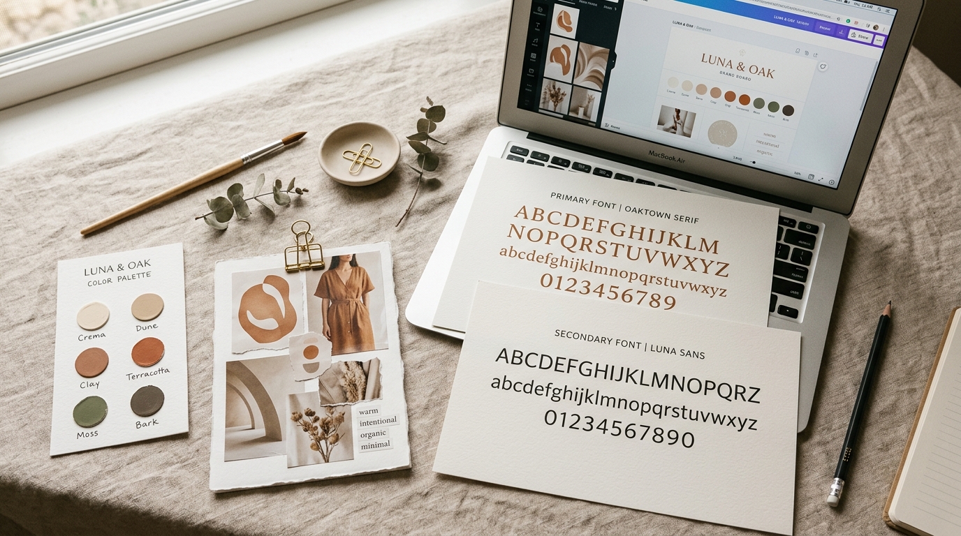
Choose a palette of two or three colours you'll use consistently: in your mockup backgrounds, in your banner graphic, in any overlay text on listing images. Write them down. A palette isn't restrictive — it's what makes everything look intentional rather than random.
Choose one or two fonts you'll use for any text in your listing images. Canva's free tier has hundreds of options. Pick fonts that match the tone of your niche and stay with them.
Shop name and profile
Your shop name is one of the few brand elements buyers see before clicking on a listing. It doesn't need to be clever, but it should be easy to remember and broadly consistent with what you sell. A shop called "NordicPrintStudio" selling boho macrame patterns has a mismatch that registers subconsciously even when buyers can't articulate why.
If you're starting from scratch, choose a name that's broad enough to grow into but specific enough to signal something. Avoid names with numbers or hyphens that make it harder to find you by word of mouth.
The shop banner is often ignored, but it's the first thing a buyer sees when they land on your shop page from a listing. A clean banner that uses your palette and shows one or two of your products in context takes 20 minutes to make in Canva and immediately makes the shop feel like a real business rather than a hobby.
Your shop bio and About section: write them in the same tone you use in your product descriptions. Consistency of voice is part of brand. A formal About page paired with casual product descriptions creates a slight friction that buyers notice without knowing why.
Mockup consistency as your strongest brand signal
Your listing images are what buyers see most often — in search results, in their feed, when they visit your shop. A shop where every listing uses the same style of mockup (same room aesthetic, same frame style, same light quality) looks like a brand. A shop where every listing was mockuped from a different random template looks like a collection of unrelated products.
This doesn't mean using identical mockups. It means making deliberate choices about the visual style — warm or cool light, minimal or styled room, framed or unframed — and applying those choices consistently across everything you list.
Using a consistent set of templates through a tool like Scaylr makes this easy to maintain. You pick your two or three core templates at the start, run every new design through the same ones, and every listing automatically looks like it belongs in the same shop. The free template library has wall art and poster templates you can use as a consistent starting point without paying for a PSD subscription.
Pick one "signature" mockup — your best, most on-brand room setting — and use it as the lead image for every listing. Buyers who see multiple products from your shop in their feed will start to recognise the style before they even see the shop name. That recognition is brand, built entirely through mockup consistency.
Free tools that do the job
Canva's free tier handles everything you need for a shop brand: banner graphics, listing overlay images, social posts, Pinterest pins. Save your palette as a brand kit (available on free) and use the same fonts across everything you make.
For fonts, Google Fonts has thousands of options that are free to download and use commercially. Start there before paying for anything.
Scaylr's free tier covers mockup generation: 30 per day with access to the free template library, which is enough for most sellers launching a new product range without spending anything.
Unsplash and Pexels offer free stock photography for lifestyle elements: background images, mood board references, supplementary listing shots.
Coolors.co is a free palette generator. Give it one colour you know you want and it suggests harmonious combinations, which takes the guesswork out of building a cohesive palette from scratch.
Building trust through reviews and communication
Brand trust for an Etsy shop comes mostly from reviews. A shop with 50 consistent 5-star reviews feels safe to buy from. A shop with 3 reviews doesn't, regardless of how good the products actually are.
Getting early reviews means following up after delivery. Etsy allows sellers to send a message after an order ships — a short, genuine note asking the buyer to reach out if anything isn't right, and letting them know you'd appreciate a review if they're happy, goes a long way. Keep it brief and human rather than scripted.
Your response to any negative review is also a brand signal. Other buyers read those responses. A calm, professional reply that acknowledges the issue and offers a resolution tells potential buyers more about your shop than five glowing reviews.
What to do first
In order: write the one-sentence description of your shop. Choose your palette. Choose your fonts. Pick your two or three core mockup templates and commit to using them consistently. Redo your banner if it doesn't reflect the palette. Rewrite your bio in the same tone as your product descriptions.
That's it. None of it costs money. All of it makes a measurable difference in how a shop comes across to a first-time visitor, and first-time visitors are the only buyers you have until you've been running long enough to build returning customers.
For the product side — once the brand foundation is in place — the Etsy product launch guide covers how to take a new product from research to live listing. And for the longer game, the print on demand Etsy guide covers how the whole ecosystem fits together.
The shops that look professional without a design budget aren't lucky. They made a few deliberate decisions early on and stayed consistent. Palette, fonts, mockup style, tone of voice. Each of those decisions costs nothing but time and compounds over every listing you add. Start with clarity about what your shop is, and the rest follows naturally.
The easiest part of brand to get right: consistent mockups
Pick your core templates, run every new design through them, and every listing looks like it belongs in the same shop. Free to start.
Try Scaylr Free →