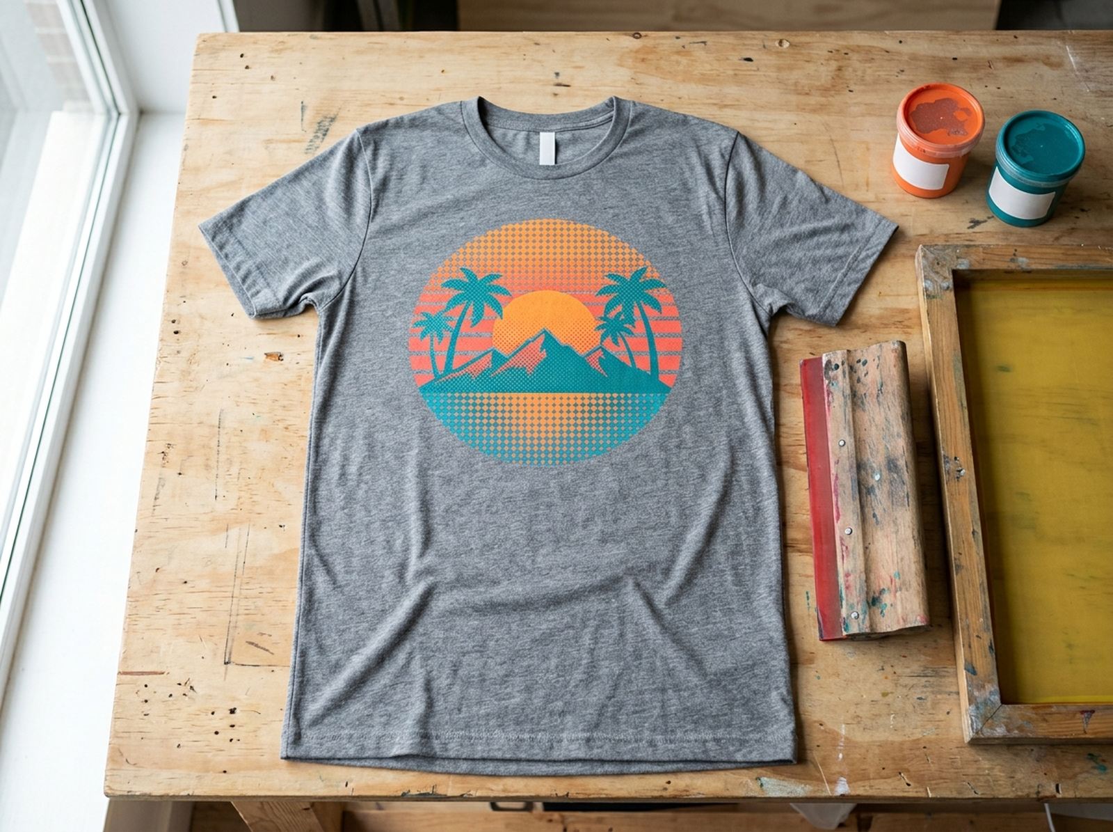
Halftone — the pattern of dots that gets bigger or smaller to simulate shading, the effect you've seen on comic-book art and old newspaper photos — isn't just a nostalgia filter. For screen printing and DTF (direct-to-film) transfers specifically, it's often a technical requirement: a solid gradient can't print reliably through a mesh screen, but a halftone pattern can. Here's what the settings actually mean and how to get a print-safe halftone without Photoshop.
Halftone converts smooth shading into a pattern of dots that vary in size — larger dots read as darker areas, smaller dots as lighter ones — which is how screen printing and DTF simulate gradients a mesh screen or transfer film can't reproduce directly. Key settings: LPI (lines per inch — 35-45 for screen printing, higher for DTF depending on your setup), angle (22.5° or 25° to avoid moiré interference patterns), and a minimum/maximum dot size so the lightest areas don't vanish and the darkest areas don't merge into a solid blob. Scaylr's free Halftone Generator handles all of this in your browser.
Why do print-on-demand sellers need halftone at all?
A photo, a gradient background, or shaded artwork has smooth, continuous tones — but a screen-printing screen only has ink or no ink at any given point on the mesh, and a DTF transfer has similar limits. There's no way to physically print "50% gray" as a continuous tone through either process. Halftone solves this by faking the gradient: enough tiny dots of solid ink, spaced and sized correctly, read as a smooth gradient to the eye from normal viewing distance, even though every individual dot is either fully printed or not.
| Setting | What it controls | Typical starting point |
|---|---|---|
| LPI (lines per inch) | Dot pattern density/fineness | 35-45 for screen printing, 35-45 as a DTF starting point |
| Angle | Dot grid rotation, avoids interference patterns | 22.5° or 25° (45° common for DTF) |
| Dot shape | Round, elliptical, or line pattern | Round is the most common default |
| Min/max dot size | Prevents dots disappearing or merging solid | Set a floor and ceiling rather than 0-100% |
What LPI is right for your process?
LPI (lines per inch) controls how fine or coarse the dot pattern is. Coarser (lower LPI) prints more reliably through a physical mesh screen; finer (higher LPI) looks smoother to the eye but is more likely to clog the screen or lose fine dots during printing and washing.
For screen printing: 35-45 LPI works for simple, cartoon-style art; 55 LPI suits a manual press; up to 65 LPI is realistic on an automatic press, which holds registration more precisely than hand-pulling a squeegee. For DTF, there's no single correct number — it depends on your printer, film, RIP software, powder, and press, so DTF shops typically start around 35-45 LPI and print test swatches across a few settings, picking the finest one that survives printing, pressing, and a wash test.
Why does angle matter more than people expect?
22.5° or 25° are the standard angle choices for a single-color halftone — not arbitrary, but specifically chosen to keep the dot rows from lining up with a screen's mesh threads or a printer's pass lines. When the dot grid and the mesh (or print head passes) align too closely, you get a visible wavy interference pattern called moiré. 45° is a common practical starting point too, especially for DTF work, but it's not a universal rule — if a test print shows a wavy pattern, the fix is usually just trying a different angle.
How do you set min and max dot size?
Without a floor on dot size, the lightest areas of your design produce dots too small to actually print or press reliably, and they effectively vanish — a highlight that should read as pale gray instead reads as blank white. Without a ceiling, the darkest areas grow dots until neighboring dots touch and merge into a solid patch, losing the halftone texture entirely (and in screen printing, risking the screen emulsion filling in). Capping both ends keeps your darkest and lightest areas actually printable, rather than just looking correct on screen.
How do you use halftone on dark shirts and dark backgrounds?
Set the dot color to white or your ink color
For dark garments, your halftone dots need to be the ink color that will actually show against dark fabric — usually white — rather than the black dots that work on a light background.
Invert tones if your source art is dark-on-light
If your source image is dark art on a light background, turn on "Invert tones" so the halftone represents where ink should print (the dark areas of the original) rather than where it shouldn't — otherwise you get the pattern backwards on a dark shirt.
Knock out any background that isn't meant to print
If your source file has a black or white rectangle behind the design that isn't part of the actual artwork, use "Knock out background" to make it transparent before generating the halftone — otherwise that rectangle gets converted into dots too.
Halftone settings that look right on screen don't always survive the physical printing process the same way — always print or press a small test swatch at your final settings before committing to a full batch, especially the first time you're dialing in LPI and angle for a new press or DTF setup.
Generate a print-ready halftone in your browser
Free, no software install — set LPI, angle, dot shape and min/max size, then export a print-ready halftone for screen printing or DTF.
Try the Halftone Generator Free →